In Fall 2014, I was an intern at Lepow. I had a wonderful opportunity to work with the Brand and Marketing team. I helped refine the visual identity.
Get to know Lepow
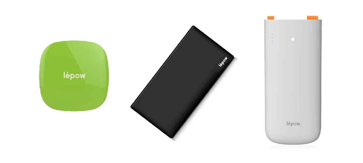
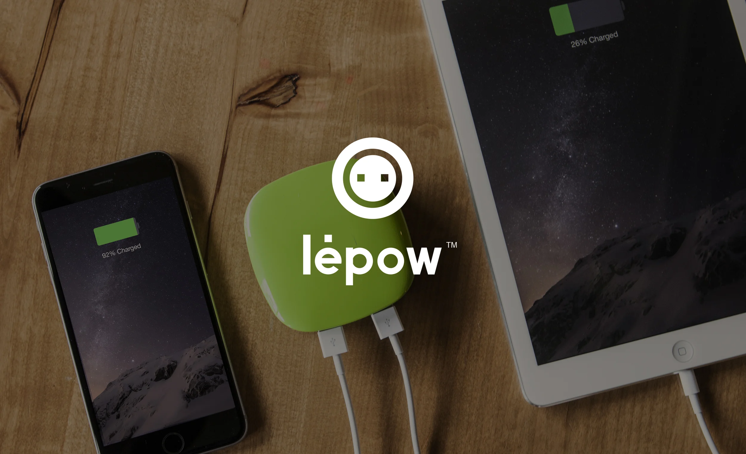
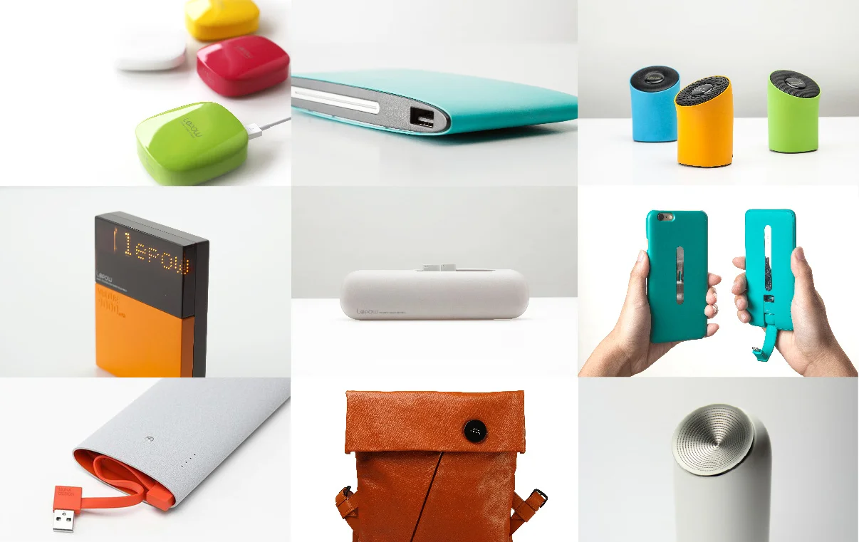
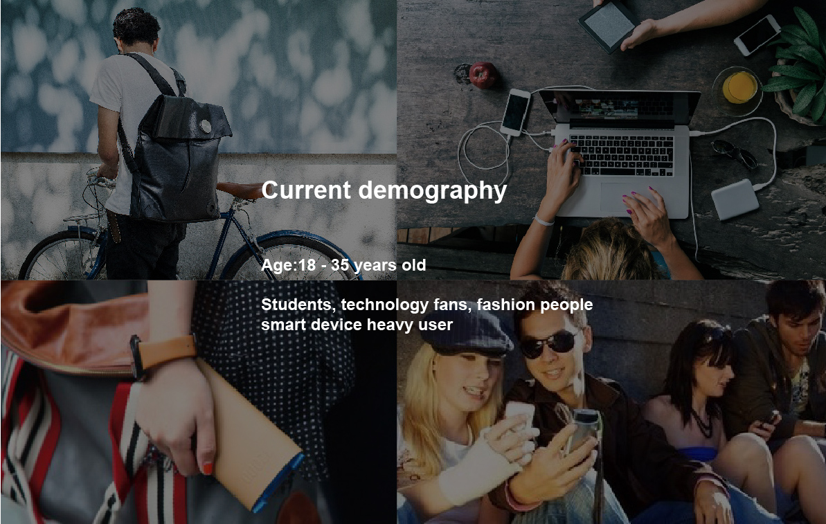
Lepow is based in Silicon Valley with roots in Shenzhen, China. Lepow's products are mainly portable cahrgers and Bluetooth speakers. Lepow is focused on the U.S. market now and added a new product line of wearable devices. The mission of the rebranding project was to change and improve the brand image to become more international and modern.
Products
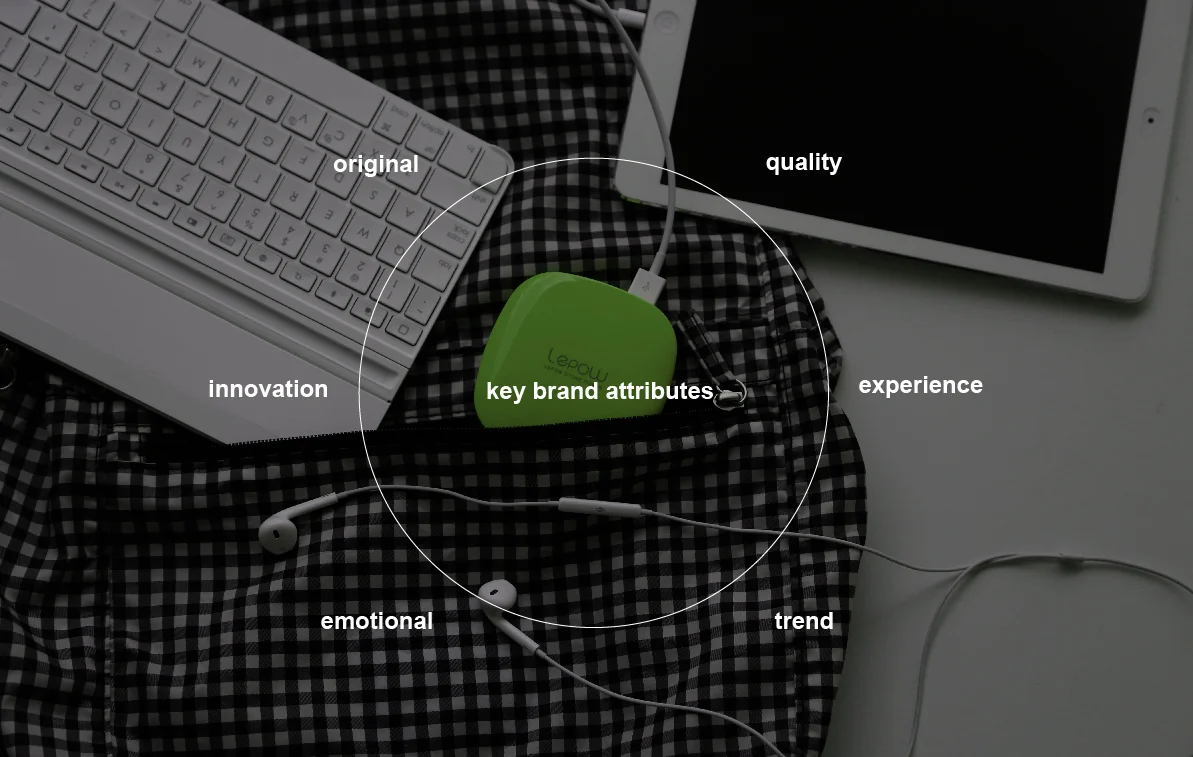
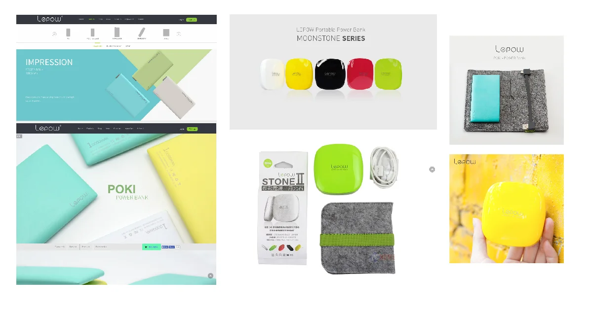
Lepow’s products are colorful and stylish. The rebranding team focus on creating a new visual identity that injects more fun, refresh and imagination into the brand image and digital life.
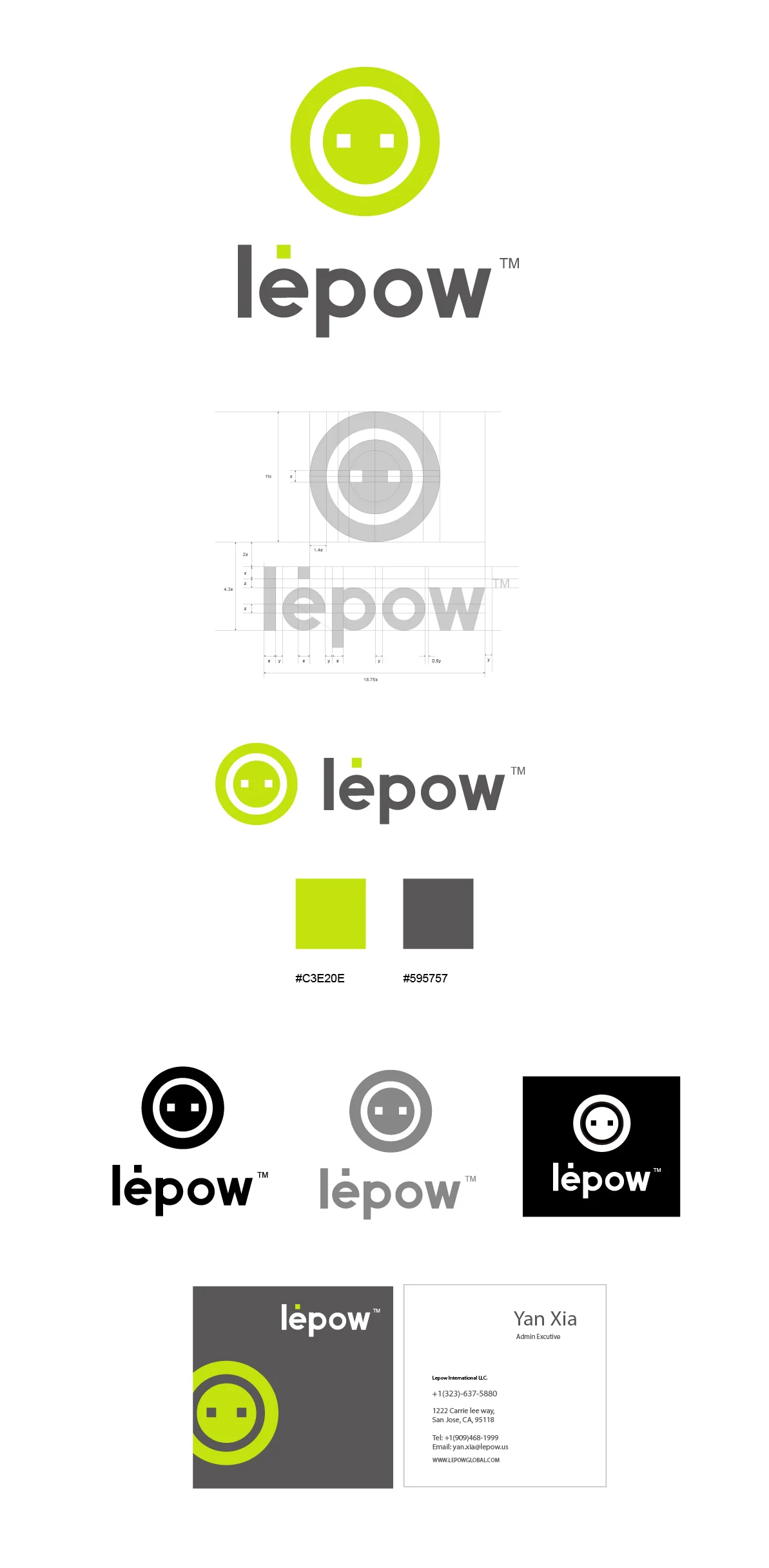
Current Identity
Failure in identity inconsistent graphics, breaks away from own color scheme, no consistant typography, and low quality photos usage.
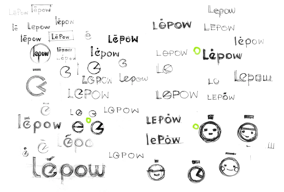
LOGO design
initial ideas
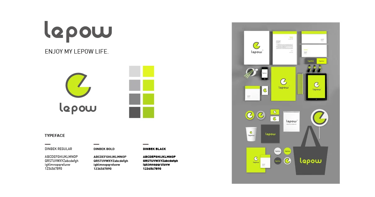
Direction 1
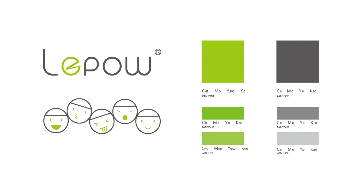
Emphasis on the happy face with "e", adjusted colors to become more modern and young : lime green and grey.
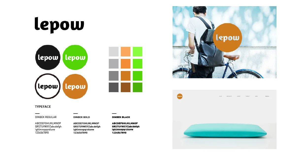
Direction 2
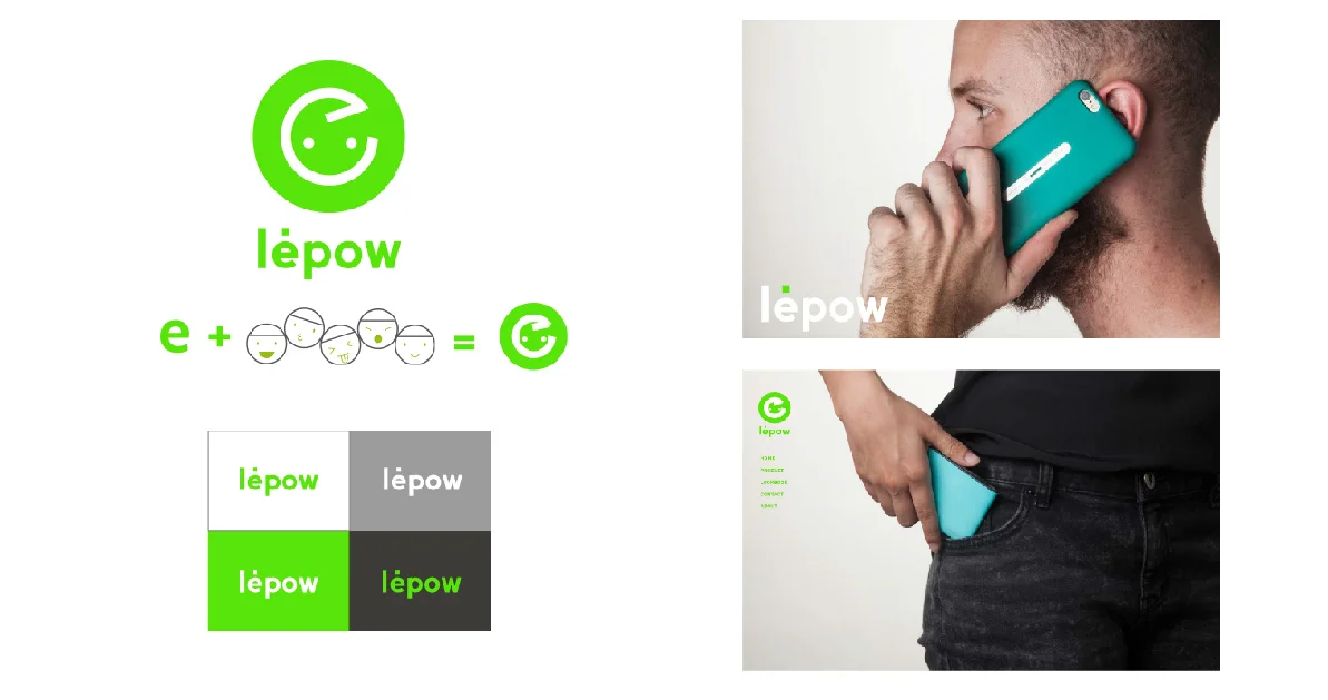
Direction 3
Simplified the five faces to one main logo. The concept is combining the "e" and face. Add a dot above "e" of the type logo. The dot is the symbol of ideas, inspiration, passion and creation.
Design development
I did more exploration of the faces, at the same time, seeking for more concepts by multiple variation.
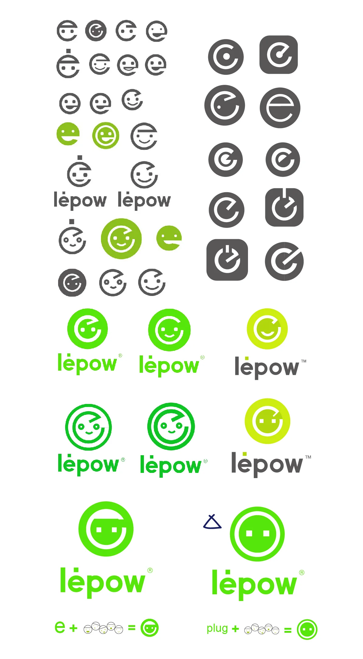
Final design
Finally, we chose the design that combined the image of a plug and a face. Kept using lime green and grey as the company's color scheme.